Finished Designs
With Parker Steel, I knew that they wanted a clean and modern look for their new brand. I also knew that they wanted to be seen as dependable and strong. In many of my early sketches, I found myself trying to be too literal and trying to include objects related to steel in the logo. I found that taking a step back and focusing on portraying the brand's values through aesthetics and feel would achieve a much more professional brand.
In the early drafts of my logo, I played around with many different layouts and methods of portraying Parker Steel but found myself intrigued by the way the P of the middle right logo was bleeding off the edge of the box. I went forward with that design and made a few changes. I changed the color to a brighter red. I changed the font to the one seen in the top left logo design. I brought the red box further down, making the "P" extend past the top of the box.
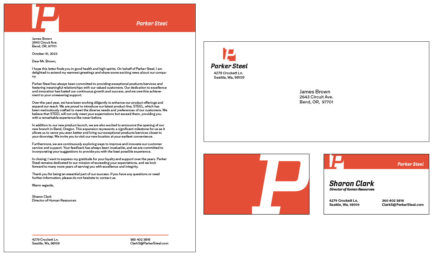
With my stationery set, I was playing around with different ways of organizing content and placing my logo. I was really attracted the the solid red bars on the business card. I found the horizontal rules to be too thin and apologetic. The red bars felt more solid and added stability to the layout. During critique, it was also brought to my attention that there wasn't much of a reason to keep the front of the business card. As it was, it was adding very little to the brand.
With the next draft, I spiced up the front of the business card and made the three pieces of collateral more consistent in appearance. I got rid of the blue and yellow from the color palette, as the red felt much bolder. During critiques, my classmates loved the new business card. They loved how bold it was, to the point that they felt the appearance of the logo on the letterhead and envelope felt too apologetic.
I have really fallen in love with this brand's aesthetic. It is very bold and simple. During the process of this project, I have found that simplicity is something I have been taking for granted. I often find myself overcomplicating designs, only to later find myself unsatisfied. During this project my professor said that a good brand shouldn't need any extra frills to make it look nice, a good brand should be able to be beautiful by itself. I have taken these words to heart. Simplicity is beautiful.