Finished Designs
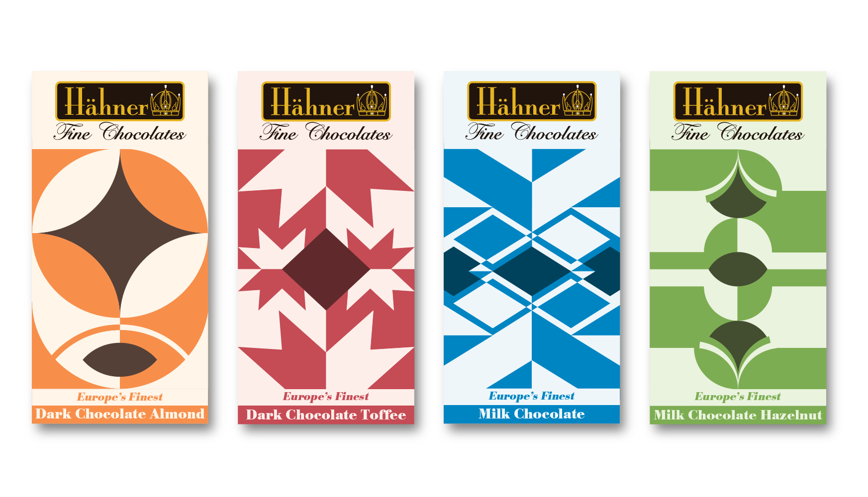
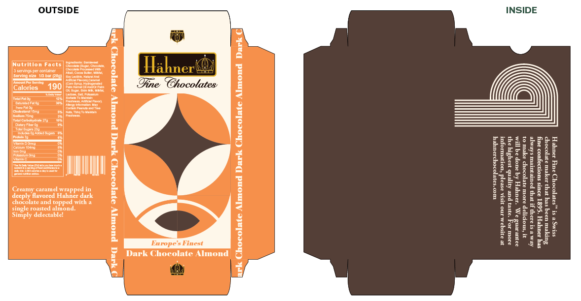
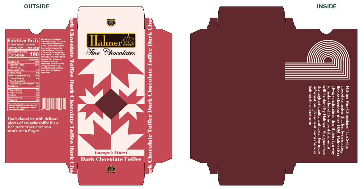
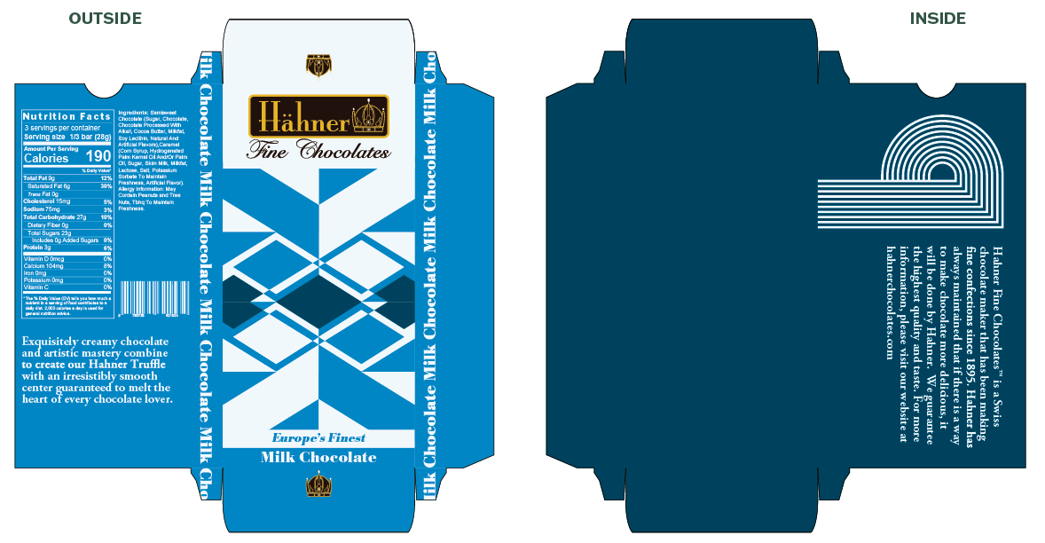
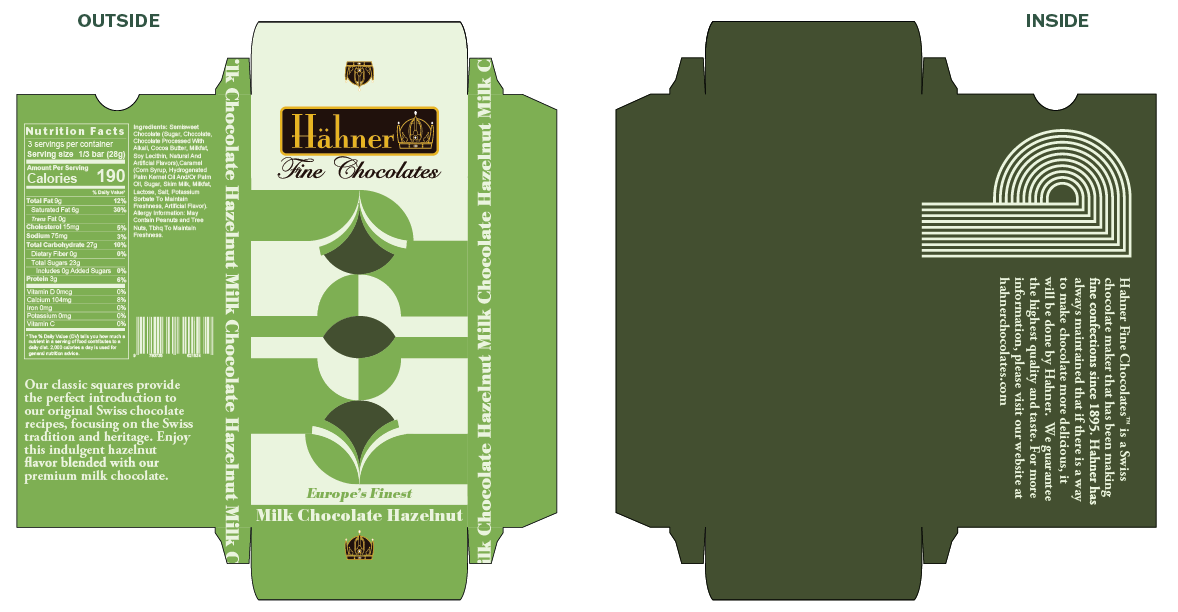
With Hahner Fine Chocolates I was interested in incorporating swiss design into the packaging. I spent a lot of my time during the early stages of development testing out different pattern ideas. I tried out a lot of different geometric shapes and different colors. The hardest part was making the pattern not feel too complicated or too simple. I finally created the pattern for the dark chocolate almond bar and fell in love with the concept I had created. The pattern worked wonderfully as the front of th1e bars.
For my color pallettes I four disctinctly different hero colors for each bar. I also wanted the hero colors to be bright and vibrant while not feeling overbearing. I spent a long time testing out different color formulas and testing them for print. My original color palette ended up being much too dark and desaturated once printed. There were also major errors with some of the colors, such as the blue turning purple when printed. After a couple rounds of test prints with different colors I found the formulas which worked best for my designs.